- PDF
Question types
- PDF
Select question type
Open the Questionnaire section of the workbench.
Click to open the question whose question types you want to change.
Click on Pick a type and select the question type.

Select template
The question types Buttons, Checkboxes and Slider contain additional templates with which you can change the layout.
Open the Questionnaire section of the workbench.
Click to open the page and navigate to the desired question.
Click on Pick template and select a template.
💡The templates differ depending on the question type. Please refer to the information in this article.

User interface for all question types
Buttons
Workbench (default):
.png)
Choice
Question Title: Enter the question.
Question Explanation: Enter further information on the question.
Answers
Button label: Enter the answer.
Questionnaire (Default):
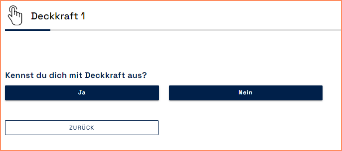
Template: Color Picker Button Type Question
Workbench:
.png)
Choice
Question Title: Enter the question.
Question Explanation: Enter further information on the question.
Answers
Hexcode: Enter a hex code.
Name: Enter the answer.
Questionnaire:
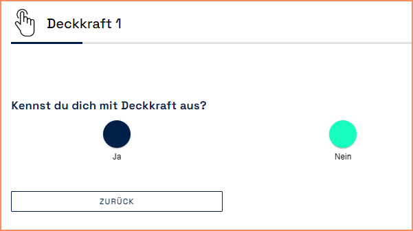
Template: Button Type Question with Images
Workbench:
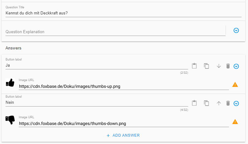
Choice
Question Title: Enter the question.
Question Explanation: Enter further information on the question.
Answers
Button label: Enter the answer.
Image URL: Enter the image URL from a public server.
Questionnaire: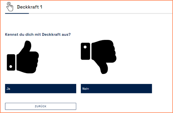
Template: Button Type Question with Images and Info Icon
Workbench:
.png)
Choice
Question Title: Enter the question.
Question Explanation: Enter further information on the question.
Answers
Button label: Enter the answer.
Image URL: Enter the image URL from a public server.
Info Icon URL: Enter the icon URL from a public server.
Info text: Info text that appears when you click on the info icon.
Questionnaire:
![]()
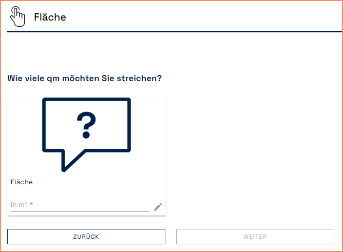
Range (input numerical value from… to)
Workbench:
.png)
Choice
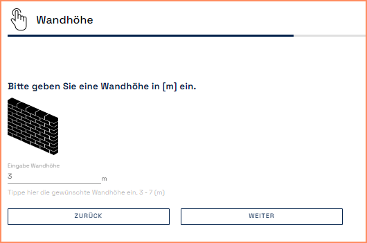
Question Title: Enter the question.
Question Explanation: Enter further information on the question.
Unit: Unit of the input value.
Answers
Range description: Enter the answer.
Placeholder: Text in answer field.
Supporting Image URL: Enter the image URL from a public server.
Minimum value: Specification of a minimum possible value.
Maximum value: Specification of a maximum possible value.
Precision in number of decimal places: Number of decimal places taken into account during input.
Pre-filled value: Pre-filled value.
💡When using filters, the product data influences the minimum and maximum values displayed. Specifying a minimum and maximum value in the question type Range limits the input in the questionnaire to the corresponding values. The upper and lower limits from the filter data are no longer taken into account.
Questionnaire:
Checkboxes (multiple selection)
💡Checkboxes are the only question type where selector users can choose more than one answer at a time.
Workbench (default):
.png)
Choice
Answers are: Selection of the logical link between the answers (OR vs. AND, see section below).
Disable Selection on Incompatibilities: Display of the incompatibility within a checkbox by graying out the answers.
Question Title: Enter the question.
Question Explanation: Enter further information on the question.
Answers
Checkbox label: Enter the answer.
Supporting Text checkbox: Enter further information about the answer.
Image URL: Enter the image URL from a public server.
Questionnaire (Default):
.png)
Logical link between checkboxes (OR vs. AND relationship)
The setting of the OR or AND relationship determines how the answers selected by the user are linked to each other.
With an OR relation, the recommended result contains at least one of the selected properties. The following example deals with the color selection of a car. The selector user has selected the color options green and yellow. The result is cars in the colors yellow, green or yellow-green patterned:
.png)
With an AND relation, the recommended result contains a combination of the selected properties. The cars are therefore yellow-green patterned (i.e. yellow and green) when the yellow and green options are selected. The platform sorts out yellow and green cars because they only have one of the selected colors.
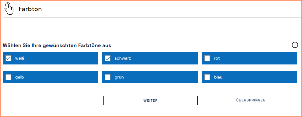
Template: Checkbox Type Question without Images
Workbench:
.png)
Choice
Answers are: Selection of the logical link between the answers (AND vs. OR, see section above).
Disable Selection on Incompatibilities: Display of the incompatibility within a checkbox by graying out the answers.
Question Title: Enter the question.
Question Explanation: Enter further information on the question.
Answers
Checkbox label: Enter the answer.
Supporting Text checkbox: Enter further information about the answer.
Questionnaire:
Cards
Workbench:
.png)
Choice
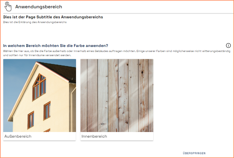
Question Title: Enter the question.
Question Explanation: Enter further information on the question.
Answers
Card title: Enter the answer.
Supporting Text: Enter further information about the answer.
Image URL: Enter the image URL from a public server.
Questionnaire:
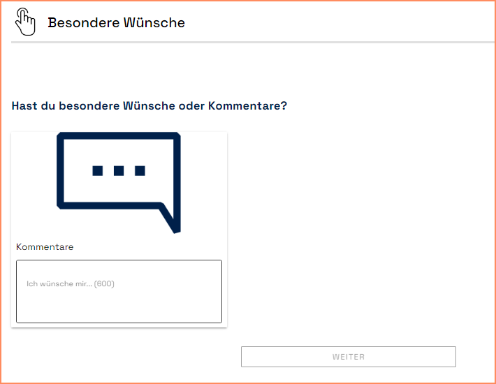
Text Fields
Workbench:
.png)
Choice
Question Title: Enter the question.
Question Explanation: Enter further information on the question.
Answers
Text input label: Label of the text field.
Text input placeholder: Placeholder for the answer.
Supporting image URL: Enter the image URL from a public server.
Questionnaire:
Slider
Workbench (default):
.png)
Choice
Question Title: Enter the question.
Question Explanation: Enter further information on the question.
Answers
Slider label: Enter the answer.
Questionnaire (Default):

💡You configure the color of the slider under Settings > Customize Theme > Secondary color.
Template: Slider Type Question with Checkbox
Workbench:
See default setting in the section above.
Questionnaire:
Selection of the template leads to the display of a checkbox in front of the slider. The user can only use the slider after activating the checkbox.

Dropdown
Workbench:
.png)
Choice
Question Title: Enter the question.
Question Explanation: Enter further information on the question.
Dropdown label: Display title in the dropdown.
Preselect first available answer: Activation leads to automatic selection of the first available dropdown answer.
Answers
Option label: Answer option in the dropdown.
Questionnaire:
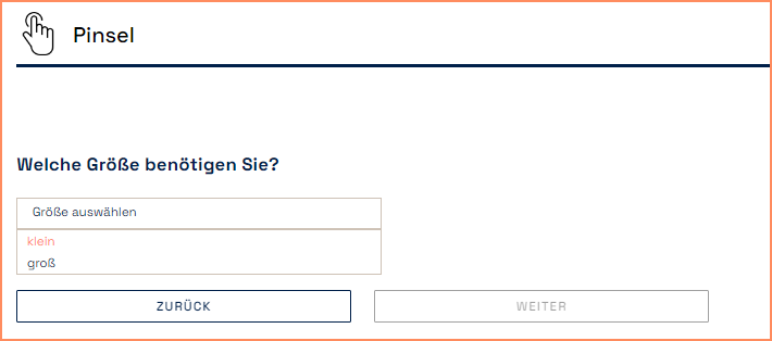
💡You configure the hover color in the dropdown under Settings > Customize Theme > Secondary color.
Double Switch
💡Suitable for questions with a maximum of two answers.
Workbench:
.png)
Choice
Question Title: Enter the question.
Question Explanation: Enter further information on the question.
Answers
Switch label: Enter the answer.
Questionnaire:
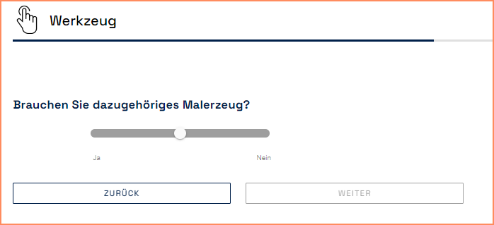
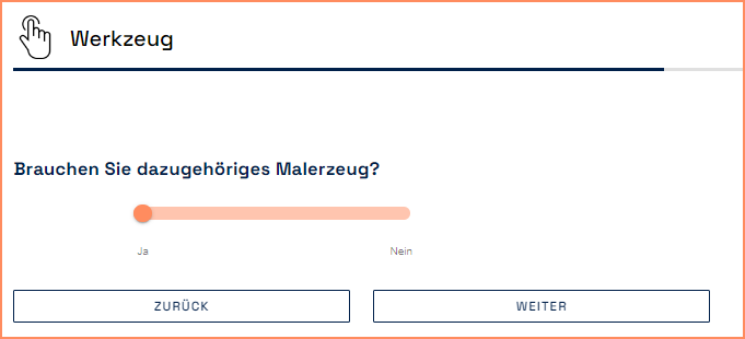
💡You configure the color under Settings > Customize Theme > Secondary color.
Number Fields
Workbench:
.png)
Choice
Question Title: Enter the question.
Question Explanation: Enter further information on the question.
Answers
Text input label: Label of the text field.
Text input placeholder: Placeholder for the answer.
Supporting image URL: Enter the image URL from a public server.
Questionnaire:
