The Settings section contains settings for the default language, data tracking, the questionnaire, CSS styling and the Reset and Publish functions for resetting and publishing the work status from the staging environment to the live environment.
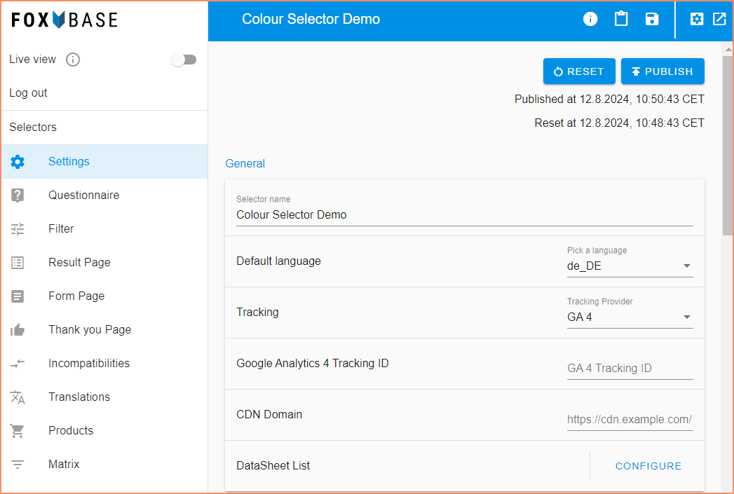
Reset and Publish
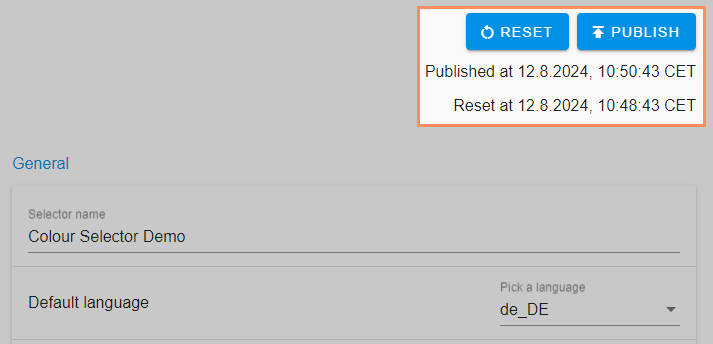
Reset: Resets the working status of the staging environment to the status of the live environment.
Publish: Publish the work status from staging to the live environment.
Published at: Date of last publication.
Reset at: Date of the last reset.
⚠️ The Reset and Publish functions cannot be undone.
General
.png)
Selector name: Name of the selector.
Default language: Default language of the selector. The platform uses the data of the standard language for the filter logic. The language should therefore be defined once and not changed again.
💡Setting the default language does not affect the display language in the selector preview. See the related article for the selector preview setting.
Tracking: Selection of the tracking provider for transmitting the selector data (see related article).
Google Analytics Tracking ID: Enter the Google Analytics ID.
Google Tag Manager ID: Enter the Google Tag Manager ID. With Google Tag Manager, you can add code snippets such as tracking codes or conversion pixels to your websites without interfering with the source code.
CDN Domain: A Content Delivery Network (CDN) is a network of servers in various data centers around the world. It is an excellent way to offer or develop your website or web application worldwide.
Questionnaire Settings
.png)
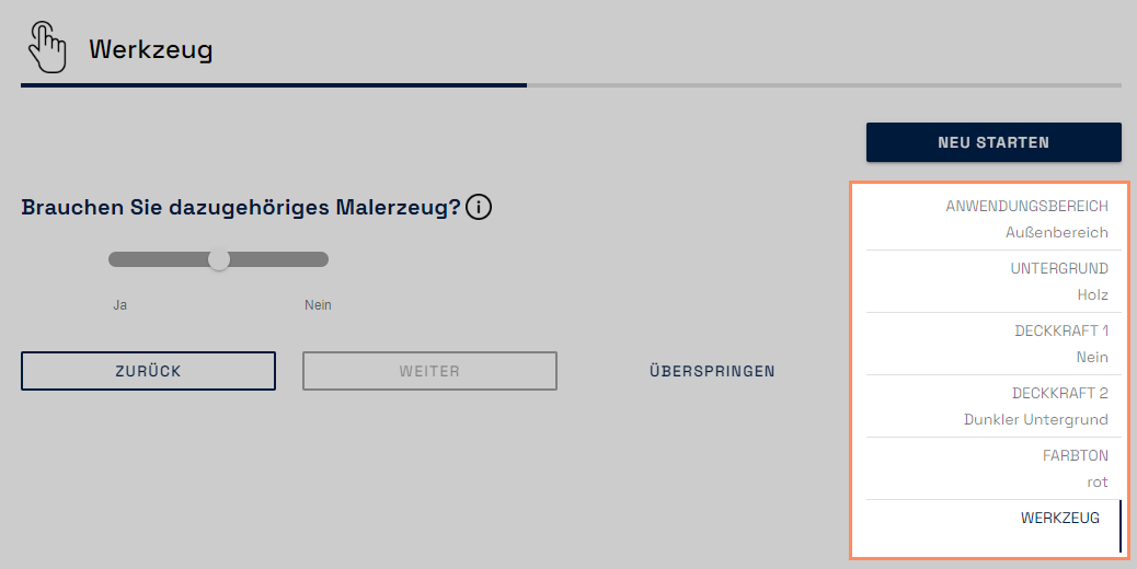
Show questionnaire navigation: Control over the display of the navigation in the questionnaire. This shows user input and allows you to return to the page by clicking on it.
Show questionnaire progress bar: The progress bar below the page title shows the user how far they have progressed in the questionnaire.
.png)
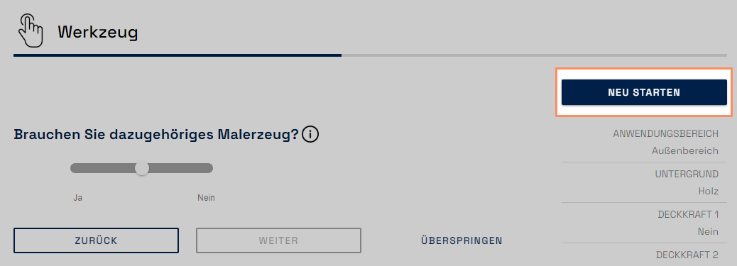
Show restart button on questionnaire page: The restart button appears on all pages of the questionnaire. This allows the user to start the questionnaire from the beginning at any time.
Remove Inputs on Update: If the user jumps back to a previous question and changes their input there, all subsequent answers that have already been given are deleted.
Forward to No Result Page on Dead End: If there is no matching result, the selector user is taken directly to the No Result Page and does not have to answer any more questions. You configure the contents of the No Result Page in the Workbench under Result Page > No Result Page.
Save Recommendation Data to Session Storage: The Internet browser's session storage saves the recommendation shown on the results page, for example for linking to a shopping cart.
Send user to last valid input: If a user closes the selector and then opens it again, the user is navigated to their last input and does not have to answer the questionnaire from the beginning.
Scroll to top on page change: Each page of the questionnaire automatically starts at the top when this toggle is activated.
Display Back Button on Questionnaire Page: The back button is activated by default. With this function you can set embed parameters under which the button is activated or deactivated.
Display Restart Button on Result Page: With this function you can set embed parameters under which the restart button on the results page is activated or deactivated.
Float number format: Setting whether the decimal numbers visible in the selector are separated by commas or dots.
Customize Theme
.png)
Position of Info Button: Setting the position of the info icons in the questionnaire (right-aligned or directly next to the question). The icons are configured via the Questionnaire area (see related article).
Primary Color: Setting the primary color (format: hex code, e.g. #00204a). Influences the color of the font, buttons and progress bar.
Secondary color: Setting the secondary color (format: hex code, e.g. #00204a). Influences the color of the Slider and Double Switch question types.
Background color: Setting the background color (format: hex code, e.g. #00204a).
External CSS and CSS Editor
In addition to the basic settings described above, you can customize the design of the selector with CSS code.
.png)
External CSS: Storing the URL of an external CSS document. The platform transfers the styling to the selector.
CSS Editor: Storing the CSS code directly in the editor. The code in the editor overwrites the code from stored external CSS links. See the related article for tips on working with CSS code in the editor.
Customize Texts
Customize Texts contains labels for buttons with which users navigate through the questionnaire.
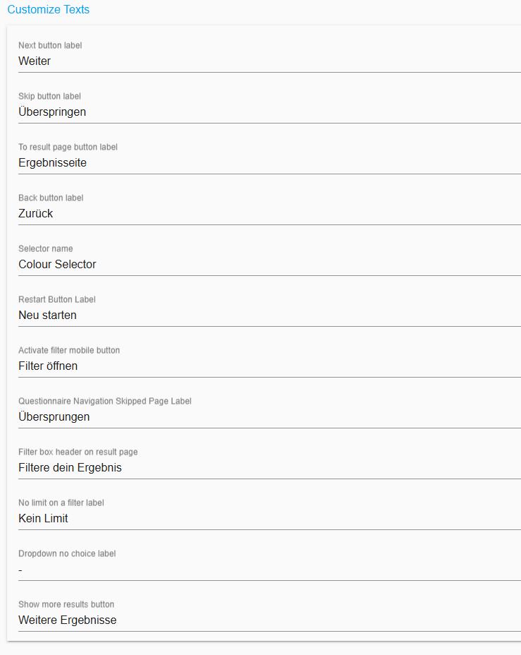
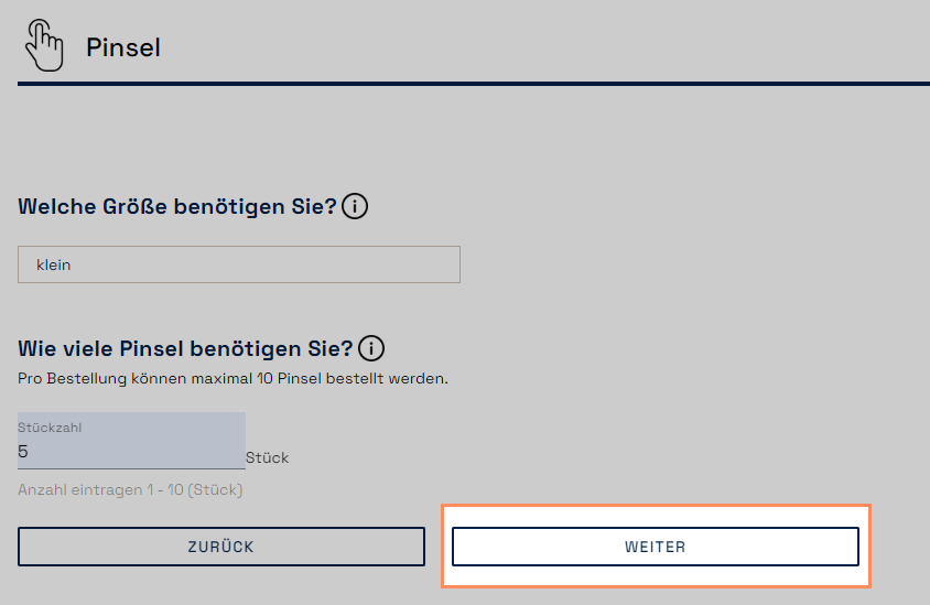
Next button label: Button that leads to the next page. The button is visible for more than two questions on one page, questions of the types checkbox, slider and double switch as well as for skippable questions.
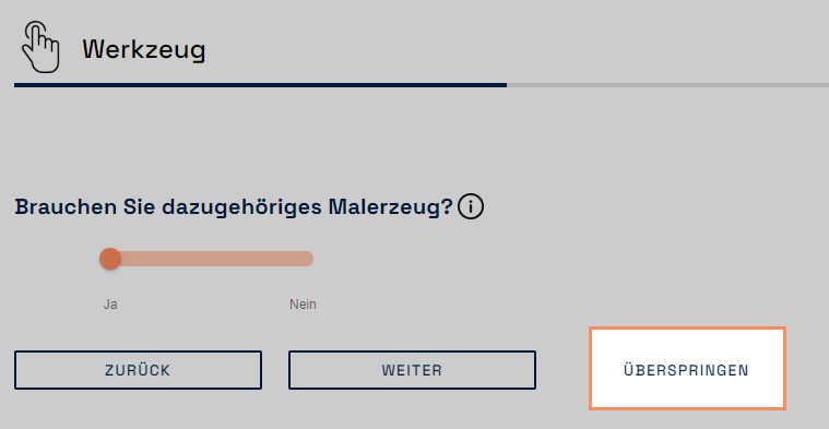
Skip button label: Button for skipping a page (setting: Open questionnaire > Page > Activate Toggle Required )
To result page button label: Button in the questionnaire that leads directly to the results page when the questionnaire is completed.

Back button label: Button that leads to the previous selector page.
.png)
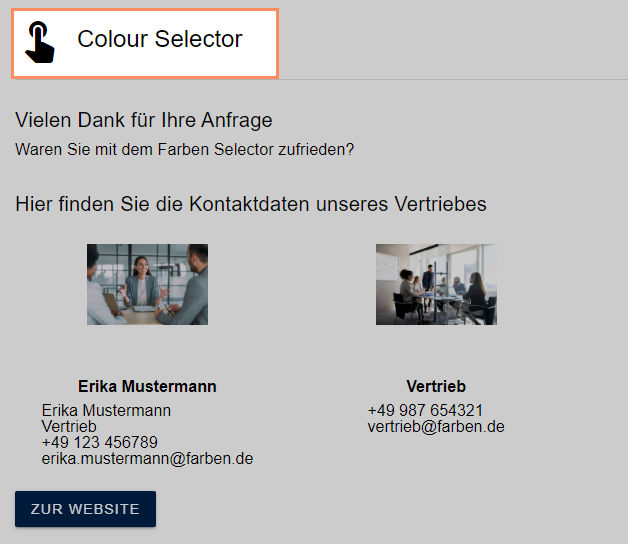
Selector name: Name of the selector that appears to users on the Thank You page after submitting the contact form.
Restart Button Label: Button for restarting the selector.

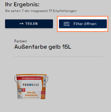
Activate filter mobile button: Button that opens the result page filter in the mobile view.
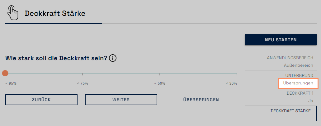
Questionnaire Navigation Skipped Page Label: Labeling of skipped pages within the navigation bar.
Filter box header on result page: Header for secondary filter on result page.
.png)
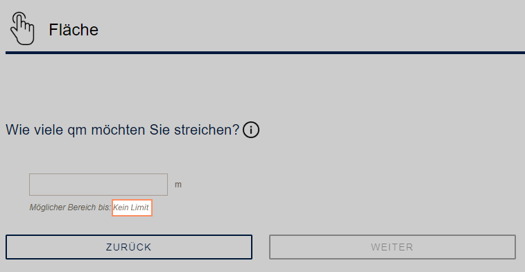
No limit on a filter label: Display text for a questionnaire filter without minimum or maximum.
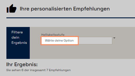
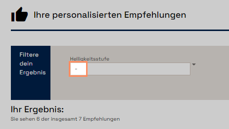
Dropdown choose option label: Initial display for secondary filters of type Dropdown. Indicates to the user that they can use the secondary filters to select further options.
Dropdown no choice label: Display for secondary filters of the dropdown type if no selection is available.
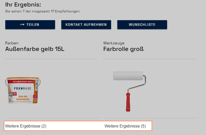
Show more results button: Display on the results page, which opens further matching results by clicking on it.
Danger Zone

⚠️ Delete Selector deletes the selector irrevocably.