Create standard contact form
The Foxbase standard contact form enables the creation of form fields and subsequent e-mail notifications (see related article) directly in the Workbench.
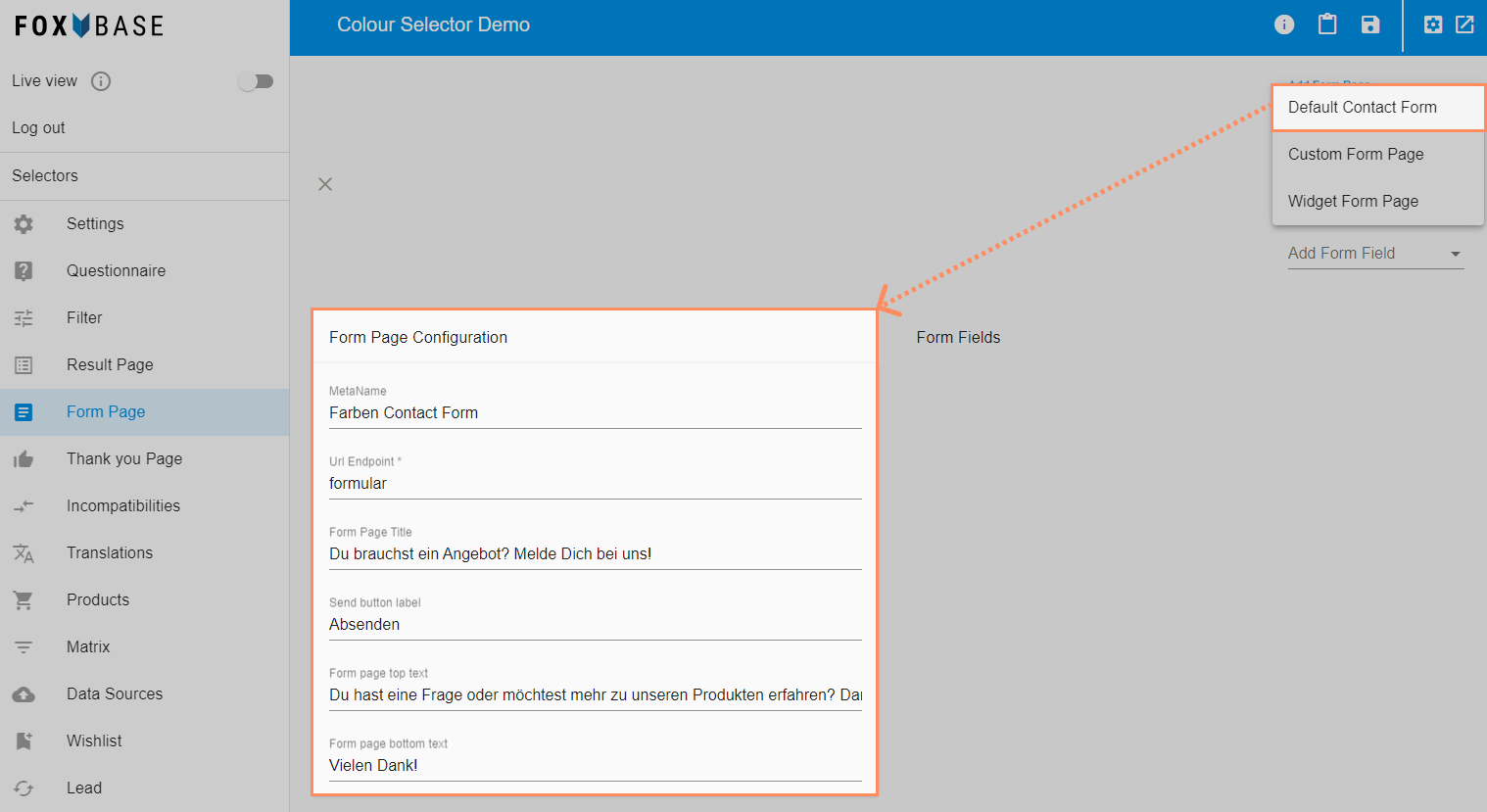
Open the Form Page area in the Workbench.
Click on Add Form Page > Default Contact Form.
Enter the name of the form under MetaName.
Enter a technical URL ending (without spaces) under Url Endpoint.
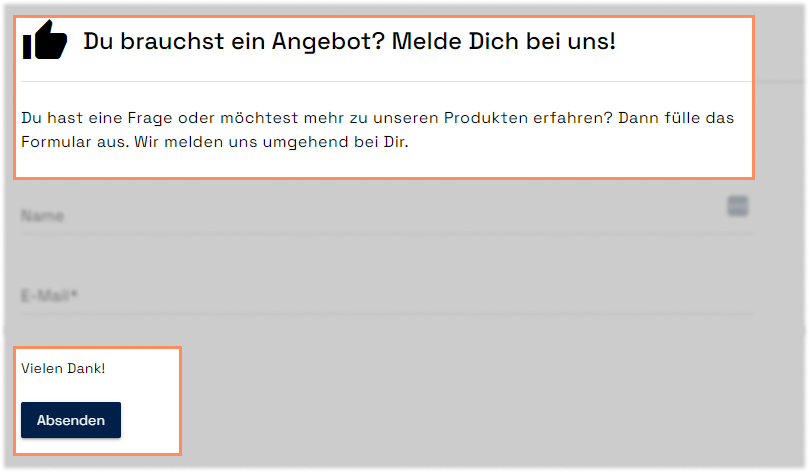
Enter a heading under Form Page Title.
Under Send button label, enter the label of the button for sending the form.
Under Form page top text and Form page bottom text, enter texts for the top and bottom of the form.
💡 The sections below show the configuration of form fields for entering customer data.
Workbench:
Form Page:
Add single-line input field
The single-line input field is suitable for entries such as first name, surname, e-mail address, etc.
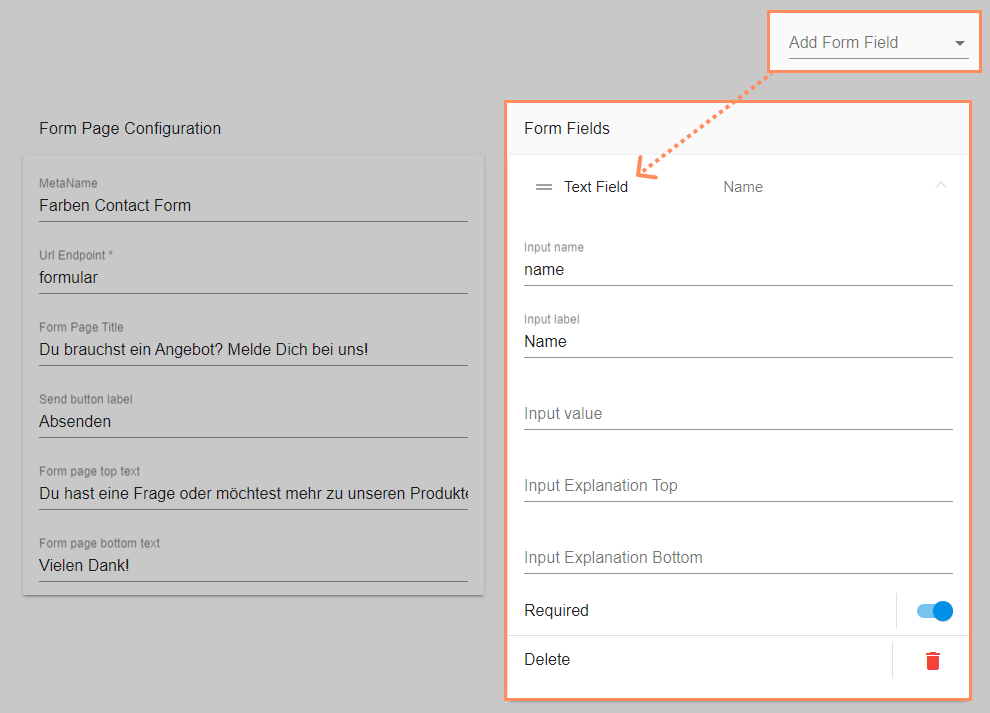
Click on Add Form Field > Text Field.
Under Input name, enter the technical name of the field (without spaces, e.g. name or email).
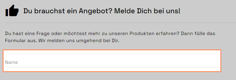
Enter the display name of the field (e.g. name or e-mail address) under Input label.
Optional: Enter a prefilled value under Input value.
Optional: Enter an explanation text above the field under Input explanation top.
Optional: Enter an explanation text below the field under Input explanation bottom.
Optional: Activate the Required toggle for the setting as a mandatory field.
Workbench:
Form Page:
Add multi-line input field
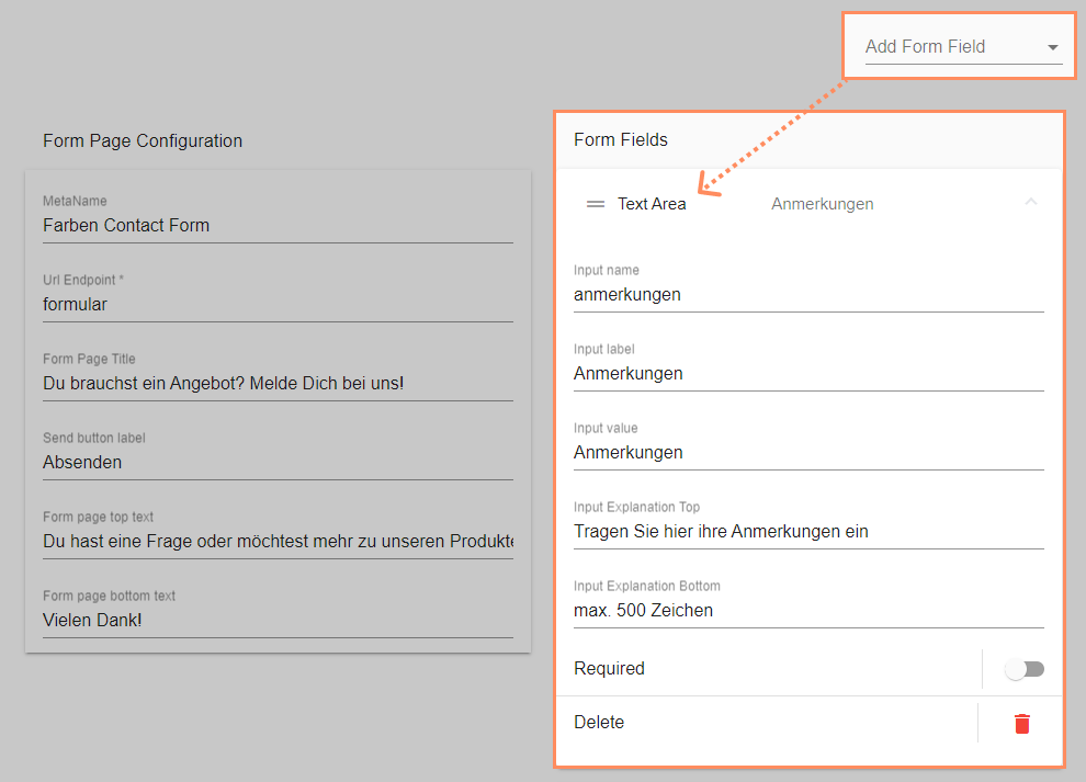
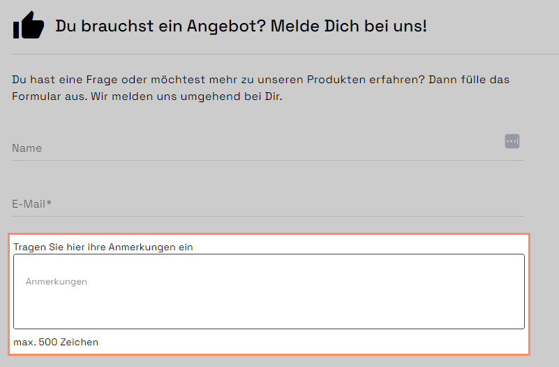
The multi-line input field is suitable for more comprehensive entries such as questions, requests, comments, etc.
Click on Add Form Field > Text Area.
Enter the technical name of the field under Input name (without spaces)
Enter the display name of the field under Input label.
Optional: Enter a prefilled value under Input value.
Optional: Enter an explanation text above the field under Input explanation top.
Optional: Enter an explanation text below the field under Input explanation bottom.
Optional: Activate the Required toggle for the setting as a mandatory field.
Workbench:
Form Page:
Add dropdown
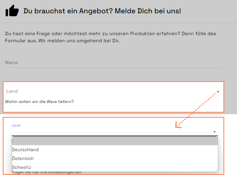
Dropdowns are suitable, for example, for selection options such as countries/regions etc.
Click on Add Form Field > Dropdown.
Enter the technical name of the field (without spaces) under Input name.
Enter the display name of the field under Input label.
Under Item Label, enter the selection options, each separated by a space and a comma: Option 1, Option 2, Option 3, …
Alternative input of the selection options:
Click on Configure next to Value list.
Select the language under Language.
Enter the display name under Label.
Optional: Enter the display value under Value. This is relevant for the control of email notifications by region or country (see related article).
Click on + Add list item to add the next selection option OR click on Select file to import the labels and values via CSV.
Click on Save.
Optional: Enter an explanation text below the field under Input explanation bottom.
Optional: Activate the Required toggle for the setting as a mandatory field.
Workbench:
.png)
Form Page:
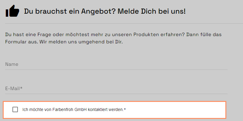
Add checkbox
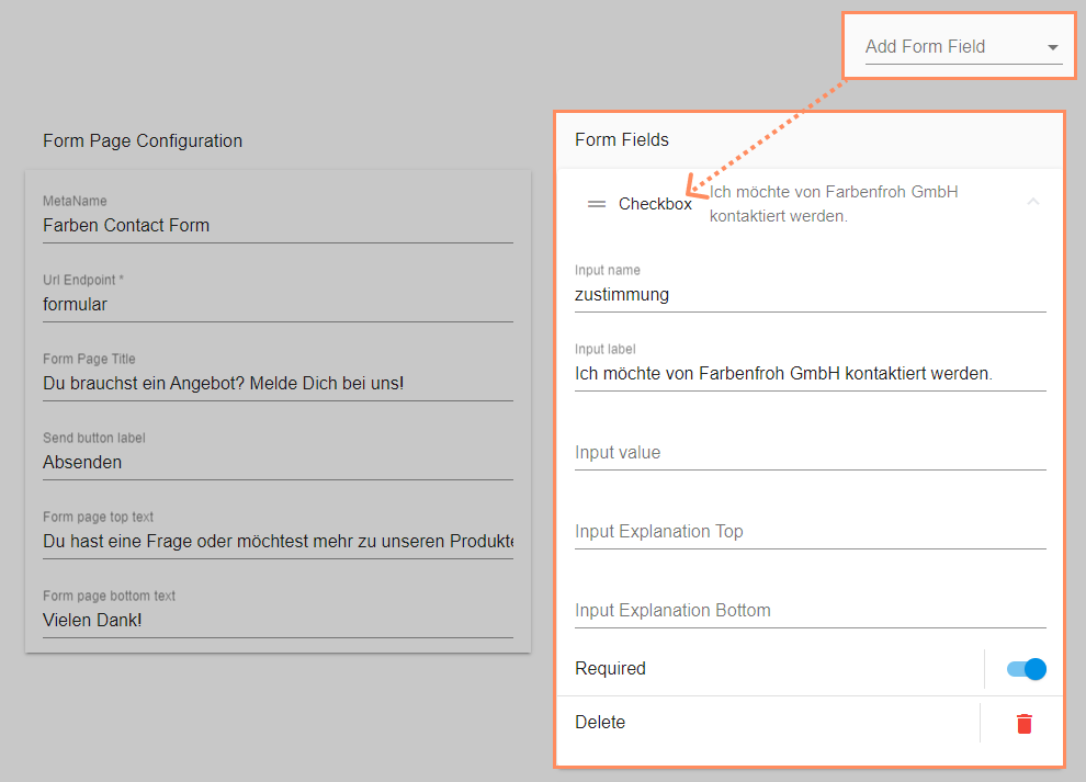
The checkbox is suitable, for example, for consents, such as for making contact.
Click on Add Form Field > checkbox.
Enter the technical name of the field (without spaces) under Input name.
Enter the display text for the checkbox under Input label.
Optional: Enter a technical input value under Input value.
Optional: Enter an explanation text above the field under Input explanation top.
Optional: Enter an explanation text below the field under Input explanation bottom.
Optional: Activate the Required toggle for the setting as a mandatory field.
💡The input value is not visible to customers. It appears within the e-mail notification, especially in the overview of form entries. If a customer confirms the checkbox, this entry appears in the e-mail in the form of the input value. If the field in the workbench remains empty, the e-mail will show Input name: true
Workbench:
Form Page:
.png)